Guidelines Home
EBONI Home
Hardware design On-screen design Next Bibliography Index Guideline 22 Guideline 21 Guideline 20 Guideline 19 Guideline 18 Guideline 17 Guideline 16 Guideline 15 Guideline 14 Guideline 13 Guideline 12 Guideline 11 Guideline 10 Guideline 9 Guideline 8 Guideline 7 Guideline 6 Guideline 5 Guideline 4 Guideline 3 Guideline 2 Guideline 1 Introduction Table of contents Previous

Hardware design On-screen design Next Bibliography Index Guideline 22 Guideline 21 Guideline 20 Guideline 19 Guideline 18 Guideline 17 Guideline 16 Guideline 15 Guideline 14 Guideline 13 Guideline 12 Guideline 11 Guideline 10 Guideline 9 Guideline 8 Guideline 7 Guideline 6 Guideline 5 Guideline 4 Guideline 3 Guideline 2 Guideline 1 Introduction Table of contents Previous On-screen design Hardware design Next page Bibliography Index Guideline 20 Guideline 19 Guideline 18 Guideline 17 Guideline 16 Guideline 15 Guideline 14 Guideline 13 Guideline 12 Guideline 11 Guideline 10 Guideline 9 Guideline 8 Guideline 7 Guideline 6 Guideline 5 Guideline 4 Guideline 3 Guideline 2 Guideline 1 Introduction Table of contents Previous page

"I like these pictures - they're just like you get in a paper book!"

Participant in EBONI geography evaluation

Readers expect images, diagrams and formulae to be included and to look as visually sophisticated as they do on the printed page. If possible, pictures should be in colour. In scientific and mathematical disciplines, it is often necessary to study diagrams and formulae closely and to make comparisons, and this should be taken into account when positioning these items in the text. In such cases, it is advisable not only to insert images, diagrams and formulae within the main body of the text (this helps break the text into short chunks, as advised in Guideline 13), but also to allow the user to view enlarged versions in a separate window.


14.1 Intersperse text with images, diagrams and formulae
14.2 Use high quality images and clear diagrams and formulae
14.3 Centre non-text elements so they stand out from the text
14.4 Allow users to open larger, more detailed, diagrams and formulae in separate windows


Consult the following recommendations from the W3C Web Content Accessibility Guidelines 1.0:
Guideline 1: Provide equivalent alternatives to auditory and visual content
Guideline 5: Create tables that transform gracefully

Figure 13.1

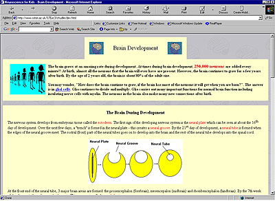
Figure 14.1. Use of images: Neuroscience for Kids by Eric Chudler

Neuroscience for Kids uses lots of brightly coloured images to illustrate the text.

Click to enlarge


Figure 13.2

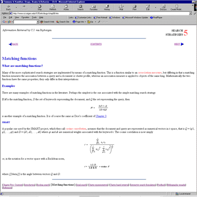
Figure 14.2. Use of formulae: Information Retrieval by Keith van Rijsbergen, redesigned by Ruth Wilson

The redesigned chapter of Information Retrieval centres formulae and separates them from the text so that they stand out clearly.

Click to enlarge


© EBONI 2000-2002
Screenshots used with authors' permission