Guidelines Home
EBONI Home
Hardware design On-screen design Next Bibliography Index Guideline 22 Guideline 21 Guideline 20 Guideline 19 Guideline 18 Guideline 17 Guideline 16 Guideline 15 Guideline 14 Guideline 13 Guideline 12 Guideline 11 Guideline 10 Guideline 9 Guideline 8 Guideline 7 Guideline 6 Guideline 5 Guideline 4 Guideline 3 Guideline 2 Guideline 1 Introduction Table of contents Previous

Hardware design On-screen design Next Bibliography Index Guideline 22 Guideline 21 Guideline 20 Guideline 19 Guideline 18 Guideline 17 Guideline 16 Guideline 15 Guideline 14 Guideline 13 Guideline 12 Guideline 11 Guideline 10 Guideline 9 Guideline 8 Guideline 7 Guideline 6 Guideline 5 Guideline 4 Guideline 3 Guideline 2 Guideline 1 Introduction Table of contents Previous

"The white background - when I blink it's like everything jumps out of the page and then goes back down again"

Participant in EBONI geography evaluation

Careful use of a few colours throughout can create a consistent style and increase the likeability and attractiveness of the book. Use of too many colours, however, can be distracting, and plain backgrounds should be used. Pure white backgrounds can "dazzle" readers, causing eye strain, and should be avoided. Where possible, colours should be customisable to suit readers' preferences (see Guideline 17).


12.1 Use a few colours (e.g. for headings and bullet points) throughout
12.2 Use the same colours throughout
12.3 Use plain backgrounds
12.4 Do not use pure white backgrounds


Consult the following recommendation from the W3C Web Content Accessibility Guidelines 1.0:
Guideline 2: Don't rely on colour alone

On-screen design Hardware design Next page Bibliography Index Guideline 20 Guideline 19 Guideline 18 Guideline 17 Guideline 16 Guideline 15 Guideline 14 Guideline 13 Guideline 12 Guideline 11 Guideline 10 Guideline 9 Guideline 8 Guideline 7 Guideline 6 Guideline 5 Guideline 4 Guideline 3 Guideline 2 Guideline 1 Introduction Table of contents Previous page

Figure 11

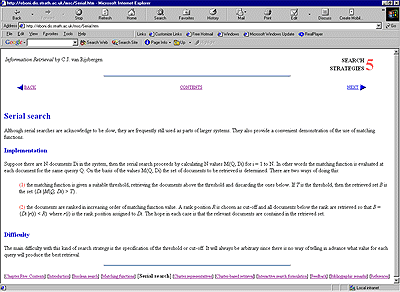
Figure 12. Consistent style: Information Retrieval by Keith van Rijsbergen, redesigned by Ruth Wilson

This redesigned chapter of Information Retrieval uses the same colours throughout (blue for headings and forward and backward navigation icons, red for keywords and bullet points) to create a consistent, attractive style.

Click to enlarge


© EBONI 2000-2002
Screenshot used with author's permission